

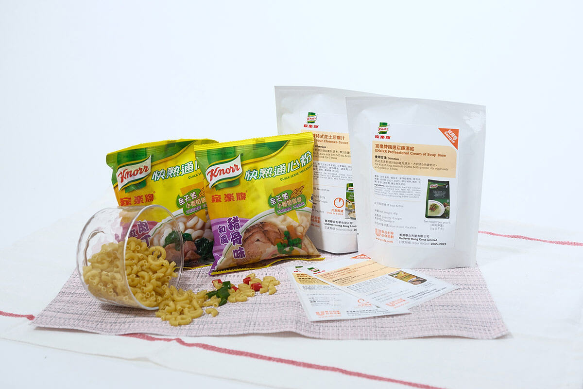
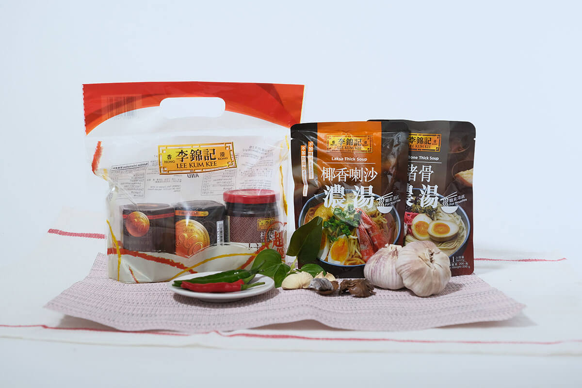
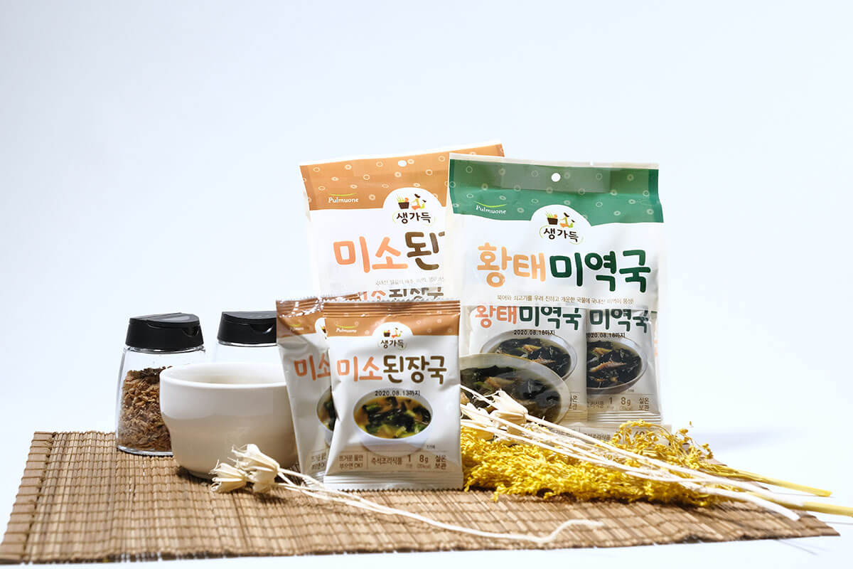
Food Packaging Promotional Packaging Pouch Shape Sustainable Digital Printing

Product packaging is an integral portion of product such that it can market the product well and tell customers to send messages. Packaging design can attract the attention of customers importantly and the customers can differentiate similar looking products. If client have never purchased in the first round, then there is no succeeding round.
With innumerable commodities on store racks, attractive and alluring designs of packaging is the sole tool which helps in locating it and maximizing sales. People unknowingly reply to stimulus related with the eye. This happens to be a primary ideology in the psychology of marketing. However, people may react either favorably or unfavorably to packaging and this provides feedback for selling more products.
What does this imply for commodity manufacturers and retailers? What it implies is that making an attractive commodity plays only a minor role in initiating sales success. Perfect ways of packaging, is also filled with attractive graphics and colors. This is crucial for gaining monetary success.
The research has indicated three more hints of attractive proofs which backs the capacity of packaging design:
- Beautiful packaging led to more enthusiasm in those zones of the brain related with impulsive decisions than colorless packaging.
- Dull and unattractive packaging results in lower levels of activity in those zones of the brain which are responsible for neutral packaging and reflective thinking.
- Beautiful packaging can lead to more rewards and replies from the zone of brain whereas packaging in triggered areas is linked with undesirable feelings.
Therefore, alluring packaging designs encourages people to choose impulsively, and overcome reflective thought and leads the buyer with a perception of getting rewarded. This is what can be described as a strong consequence.
With an intention to improve product packaging, we require to use 4 designing techniques from your mind and all have to be based on psychology.

Color evokes feelings in packaging design
There are several feelings which are associated with certain interpretations in our culture. Red is often linked with love, anger, action and passion in the United States of America. Blue is often linked with calmness, stability, credibility and also grief. Yellow is linked with delight and green is linked with finances.
The crucial aspect to remember is to select colors that motivate the kind of relationships you want client to create with your commodities.
Color should strengthen Brand Identity
If you have a brand emblem and you should then there are already several colors linked with your brand. Your emblem should be characterized mainly on your packaging such that loyal clients can pinpoint a brand they believe and new clients can get to gather knowledge of your emblem.
The color scheme that you select for your packaging design should take their hints from that emblem. Whether you select to use differentiating or identical colors, they must reside well together.
Shape and structure influence feelings in packaging design
Shapes have the power to be the only most exclusive identifier for your packaging for product.
Lines and pure shapes, without any background at all, can actually motivate fear, shocks, satisfaction or enthusiasm. So, linking a shape with a background message has the power to form even stronger emotional reactions.


Touch and texture consequence reactions in packaging design
In a flawless world, everybody who visualizes your designer packs will be encouraged to pick it up and take it to home. For that base, you should take into account while formulating plans in the packaging design.
The textures are enjoyable for touching, like even matte, smooth high-gloss, or easy and cottony will energize customers to place their hands on your commodities.
Selecting a surface for your packaging that is comfortable to touch will motivate consumers to hang on to linger and last longer. This, instead will expand the emotions of mental proprietorship and encourage the clients to buy the commodity.
Typography results in emotional reactions in packaging design
Don’t neglect the significance of font choice in your packaging design. Ultimately, the fonts are the delivery procedures for the wordy message on your package. The font should back the message you are trying to connect.
The vital point to remember is to select a font that sends the message you wish to send.
Here are some outlines:
- Hand Script Fonts: unintentional, frisky, defiant, and childish
- Sans-Serif Print Fonts: freshness, candour, straightforwardness
- Decorative Fonts: exclusive, fanciful, amusing
- Fancy Script Fonts: status, sophistication, and adulthood
- Serif Print Fonts: steadiness, session, and senior age
- Headline Fonts: eye-catching, concentrated, factual
Comprehending what a font is linking independently of the words themselves is crucial to make the appropriate font selection. Ensure the unexpressed language of your font signals the individualism of your commodity and brand.
Packaging design can do so much for your commodity and brand when pinpointed properly. Allowing your customer’s innate cultural cum psychological guide your preferences will hugely compound the probability that your package will be the one to attract the eye.


